Devlog 09: Still working on assets and other things of note.
Another 2 weeks have passed, but I'm still not finished with all the stuff I need to update for the aesthetics of the game to look cohesive. However, that's partially because I've been making progress in other areas as I personally get sick after working non-stop on assets for days at a time.
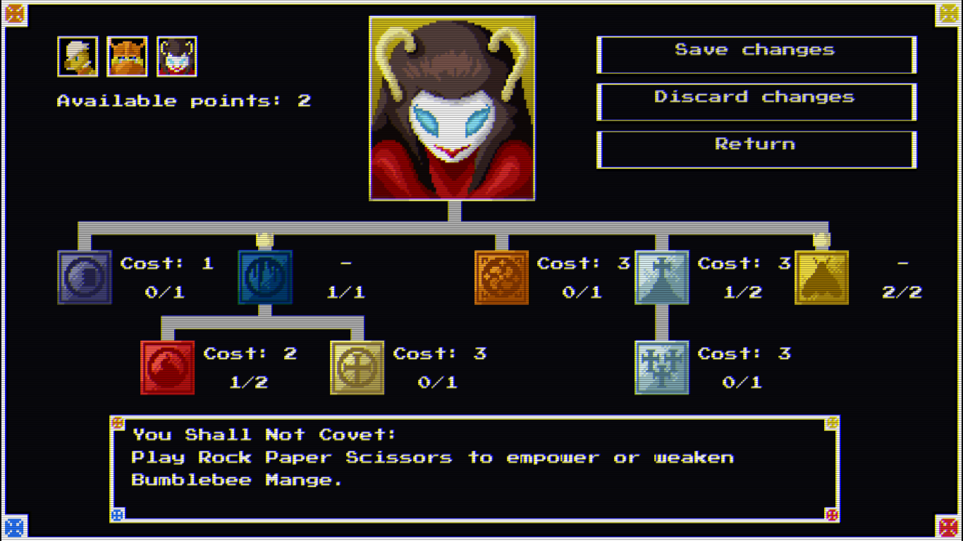
Possibly the biggest change gameplay-wise is the new perk interface. It's similar to the old system but now the player receives a point each level instead of every 3 and perk levels have costs ranging from 1 to 3 which will hopefully allow for more depth and better balancing. Each character has their own interface now so it's easier to read and all icons have a consistent art style to boot.

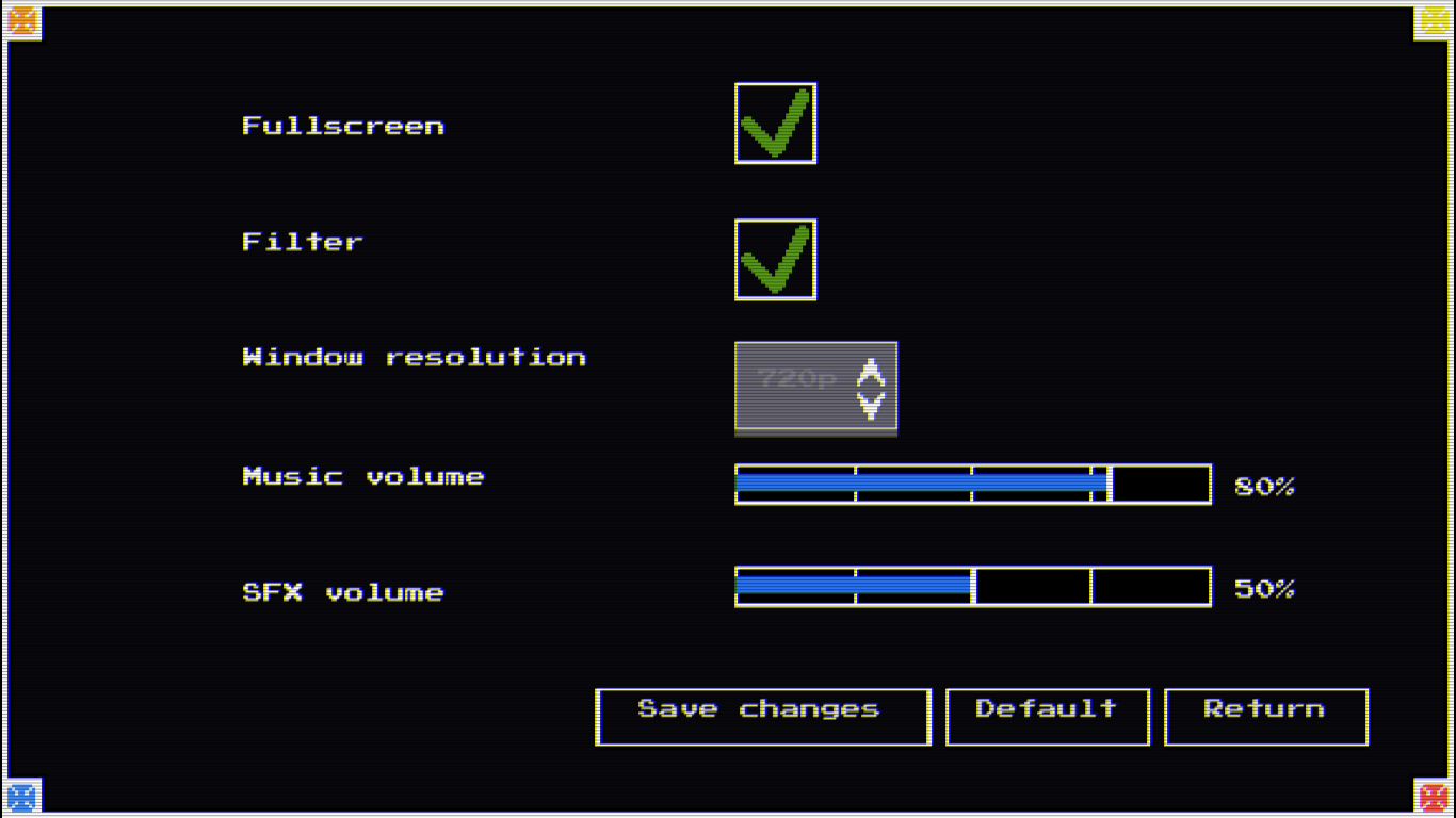
Astute readers will notice that the portrait has changed since the last update to match the new color palette and that the old filter from the first demo back in DD 48 is back, although it can be disabled in the settings menu, a feature that's far from being a selling point but it can hardly be called unnecessary.

It's rather basic at the moment, but it works. Particularly an option to mute the music is necessary in today's world as copyright strike systems have been shown to flag royalty free music if a different game has used the piece already.
Going back to gameplay changes, I've improved the code for status effects significantly since the last update, poison in particular was rather buggy due to an interaction with other damage sources. The poor initial implementation had also prevented me from adding some status effects I wanted signaled this way like in the cases of units that accumulate charges of some kind or alter primary stats other than strength.
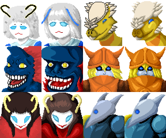
Back to the topic of assets, I'm finished with the unit sprites and portraits for the portion intended for the demo of the game once I have a Steam page up. Some of them are pretty much identical, but some of the older ones have gone through significant changes.

I especially think the fact that Haydn's portrait still had outlines is inexcusable, I have a bunch of unused sprites with them but that one made it into the working project somehow.
Finally, I implemented two features that were requested during last DD. For the longest time the dialogue boxes have a small animation where the text renders over a small period of time, but now it's also possible to skip the animation instantly by pressing enter. I'm too lazy to record a video and turn it into a gif so you'll have to take my word for it.

The second one is cheating because the feature was already in place, only nobody realized it existed. I added some buttons to the battle interface to control the speed of the game on the fly. I'll make a tutorial for this next time but it will just be like a compendium of sorts because I'm tired of remaking the damn tutorial.
Anyways, that's all I had for today. I really want to go back to making content instead of focusing on polish but the game has got to look good for the Steam release. Still, I'll have the demo ready for sure in time for the next Demo Days as always so people can actually experience these changes firsthand. See you in 2 weeks.
Get Afterlife Gladiator
Afterlife Gladiator
A fantasy turn based RPG about dead people fighting each other.
| Status | In development |
| Author | Bakar |
| Genre | Role Playing |
| Tags | 2D, Fantasy, Godot, Indie, Pixel Art, Retro, Singleplayer, Story Rich, Turn-Based Combat |
| Languages | English |
| Accessibility | Interactive tutorial, One button |
More posts
- Devlog 38: Afterlife Gladiator97 days ago
- Devlog 37: BlankOct 17, 2024
- Devlog 36: The Joy of DevelopmentOct 01, 2024
- Devlog 35: Until it ShinesSep 16, 2024
- Devlog 34: Good News, I Had a NightmareAug 24, 2024
- Devlog 33: Viva la ActualizaciónAug 10, 2024
- Devlog 32: Watching Over MeJul 22, 2024
- Devlog 31: Born to SleepJul 04, 2024
- Devlog 30 : Obligatory Fishing MinigameJun 18, 2024
- Devlog 29: Six Frames per SecondJun 01, 2024

Comments
Log in with itch.io to leave a comment.
Your new colours look much better. I think the game is going through great visual improvements. Keep up the good work
very nice.
for the stat/dialog screen, i recommend changing the background or adding a texture or something, since the scanlines coupled with the rest of the design makes me think of a sci-fi communication tool like in Metal Gear or a hologram or something, instead of fantasy.